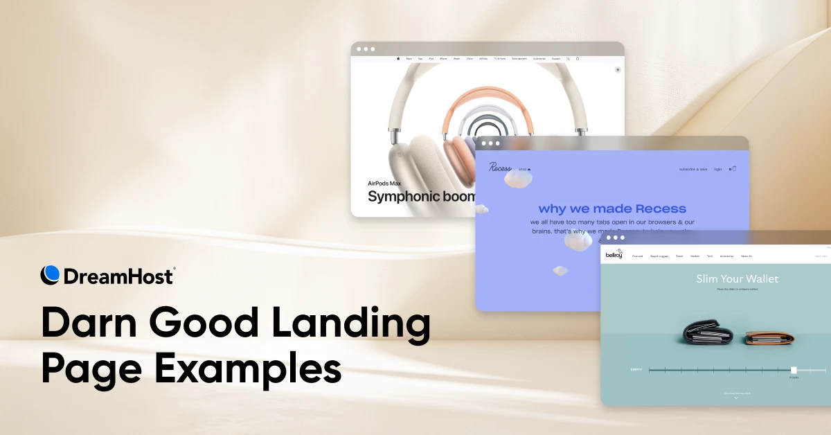
15 Product Landing Page Examples That Convert

Have you ever stared at a blank WordPress page for so long it starts to feel like your laptop is judging you? Welcome to the rite of passage known as “trying to build a product landing page.”
We’ve all been there —too many tabs, too few ideas, and a little voice in the back of your head whispering, “Is Comic Sans…bad?”
via GIPHY
Welcome to the only guide you need on how to build a landing page, or a standalone web page created with a single goal in mind. For product pages, the goal is usually to sell something or encourage a signup.
Unlike your homepage (which wears too many hats), a landing page does one job —and does it well.
Below, we’re showing you 15 product landing page examples that don’t just look good; they actually convert. And more importantly, we’ll break down why each one works and how you can apply the same strategies to your own site. No design degree required.
Let’s ditch the design paralysis and get building.
What Makes a Product Landing Page Convert?
Before we dive into examples, it helps to know what you’re looking for —and what you should build toward. While great landing pages come in all shapes, sizes, fonts, and colors, the best ones tend to nail these four elements:
1. A Clear, Singular Focus
A product landing page should do one thing and do it well. That might be selling a single item, promoting a feature, or getting someone to subscribe. The key is to avoid distractions. No menus, no footers full of blog links, no mixed CTAs.
Pro tip: Before you design anything, ask: “What exactly do I want someone to do on this page?” Then build everything around that.
2. Visual Storytelling
People process images 60,000 times faster than text. So if you’re trying to explain a product, showing is usually better than telling. That could mean product videos, lifestyle photography, animations, or live demos.
Pro tip: Start with one great product image or video and build your layout around it.
3. A Compelling Value Proposition
A value prop isn’t just a feature list —it’s a promise.
What are you offering? Who is it for? Why is it better than the alternative?
The sooner a visitor understands those three things, the sooner they can become a customer.
Pro tip: Write a sentence or two and answer this question: “Why should someone buy this right now?” Put that at the top of your page.
4. Trust Boosters
People don’t trust websites by default. Reviews, testimonials, star ratings, media mentions, and badges (like a 30-day guarantee) all help newbies overcome their skepticism. If you’re a newer brand, this is especially critical.
Pro tip: You don’t need a Wall Street Journal quote. A short, positive customer review can work wonders.
15 Product Landing Page Examples That Get It Right
Each of the following examples puts the core conversion principles above into practice, but there are more reasons why these pages are so successful. Below, we’ll break it all down, along with tips on how to recreate similar results on your own site.
1. Notion Calendar
✅ Clear focus✅ Visual storytelling✅ Value prop✅ Trust
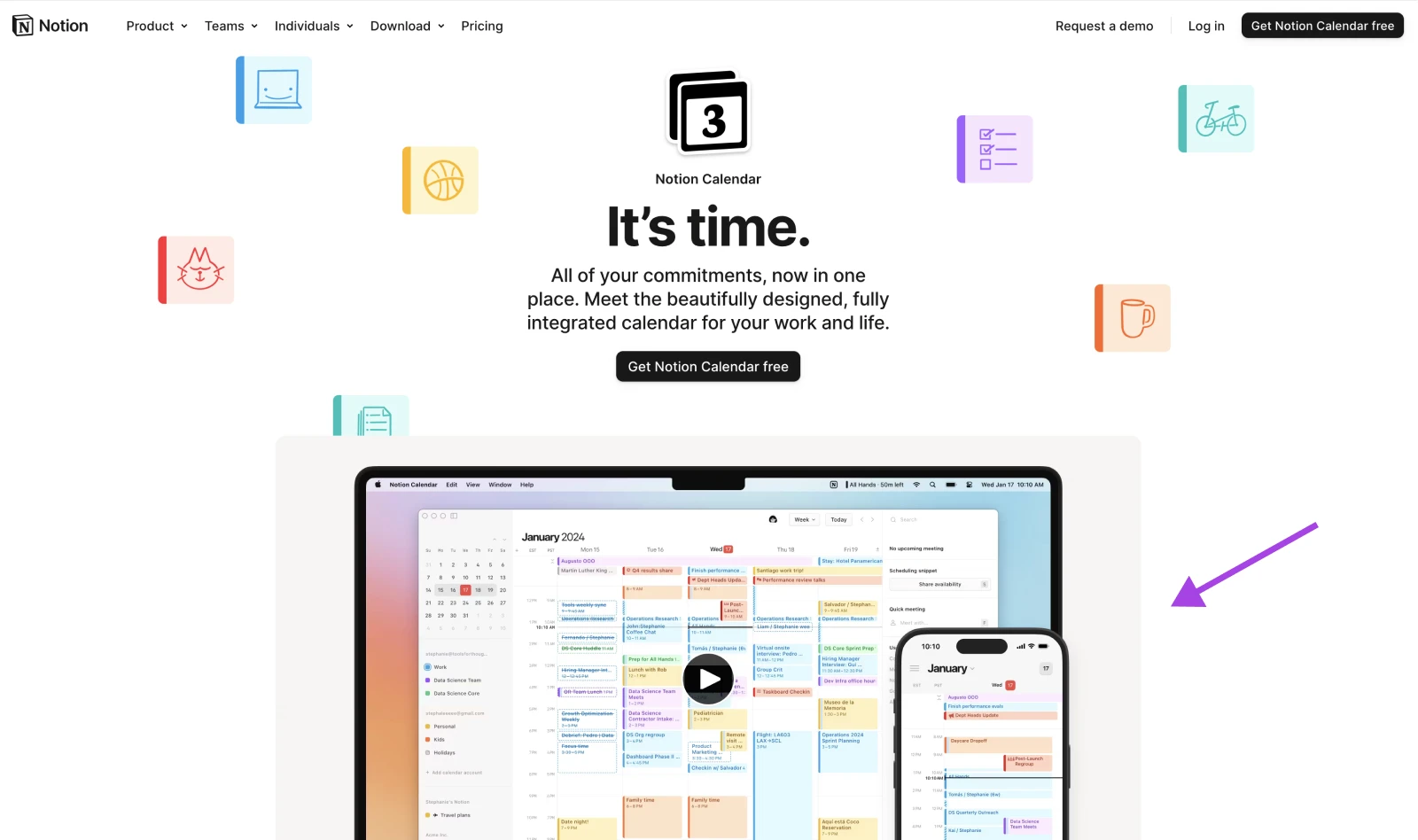
What works: Notion introduces its Calendar with calm confidence. There’s no clutter, just a clean headline and an animated walkthrough that instantly communicates the product’s purpose. It’s less “sales pitch” and more “guided tour,” which builds trust quickly.
Steal this idea: Use an above-the-fold video (or even something like a scroll-triggered animation) to show your product solving a specific pain point. Don’t over-explain —just let the product shine.
2. Bellroy
✅ Visual storytelling✅ Value prop✅ Clear focus

What works: The star of this page is the slider that compares Bellroy’s slim wallet to a bulky one. No text necessary, you immediately understand the product’s value.
Steal this idea: Use an interactive element to demonstrate your product’s advantage in seconds. Can’t code a slider? No problem. You can use a simple before-and-after image comparison to get a similar effect.
3. Apple AirPods Max
✅ Visual storytelling✅ Value prop✅ Clear focus
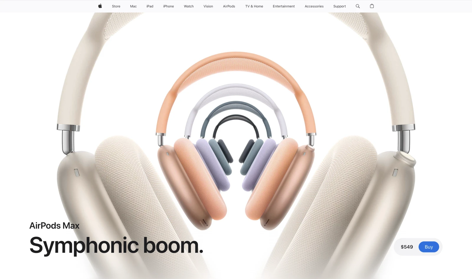
What works: Apple pages are masterclasses in restraint. This one is visually rich but copy-light. As you scroll, each section presents a feature with clean visuals and just enough supporting text.
Steal this idea: Create a scannable landing page with one feature per section. Use strong visuals, short headlines, and limit text to a couple lines per point.
4. Stripe Checkout
✅ Clear focus✅ Value prop✅ Trust boosters
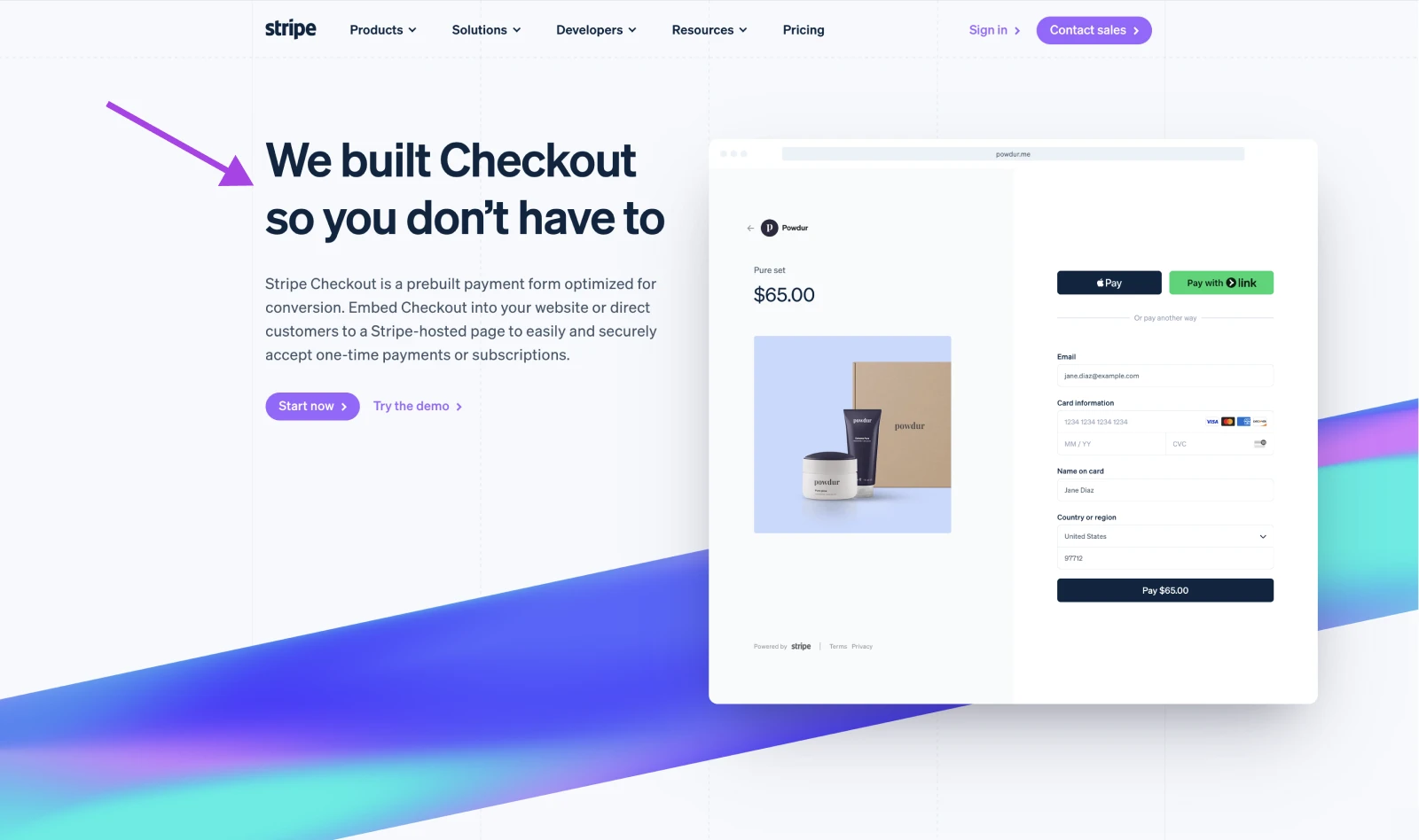
What works: Stripe leads with clarity: “We built Checkout so you don’t have to.” The product demo is interactive and layered with technical documentation and feature highlights. This page builds confidence for developers and decision-makers alike.
Steal this idea: Your headline should make your offer obvious in one sentence. Reinforce that with “micro-demos” or animations to show how easy it is. If you can’t build interactive demos, use looping GIFs or short embedded videos to highlight functionality.
5. Figma Dev Mode
✅ Visual storytelling✅ Value prop✅ Trust boosters
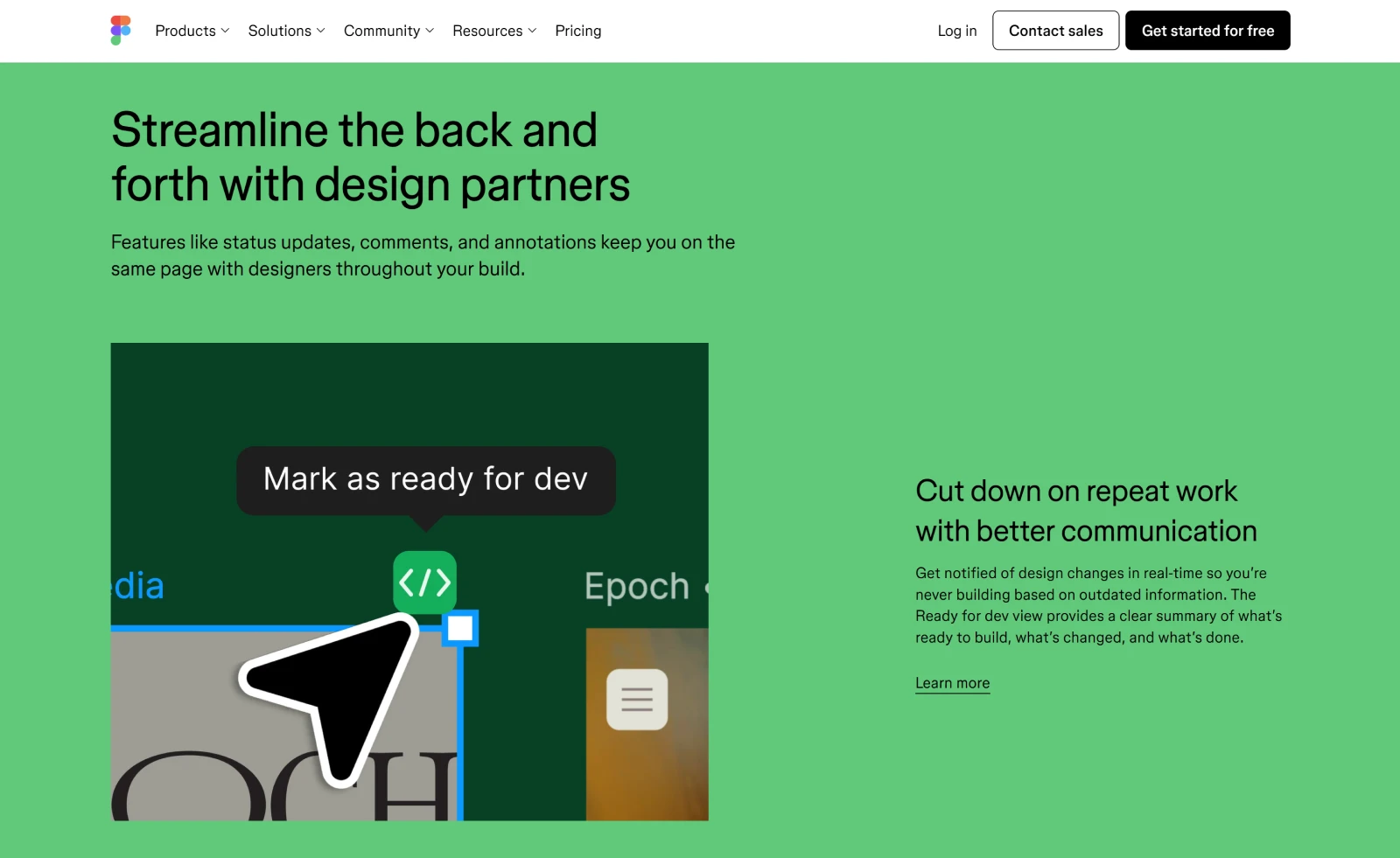
What works: Dev Mode is tailored to developers with clean animations, use-case examples, and testimonial quotes that speak directly to pain points. Each section answers one question and then shows the solution.
Steal this idea: Structure your page around user problems, not product features. Ask yourself: what’s the #1 problem my audience has, and how does my product solve it? Make that your first headline.
6. Recess
✅ Visual storytelling✅ Value prop
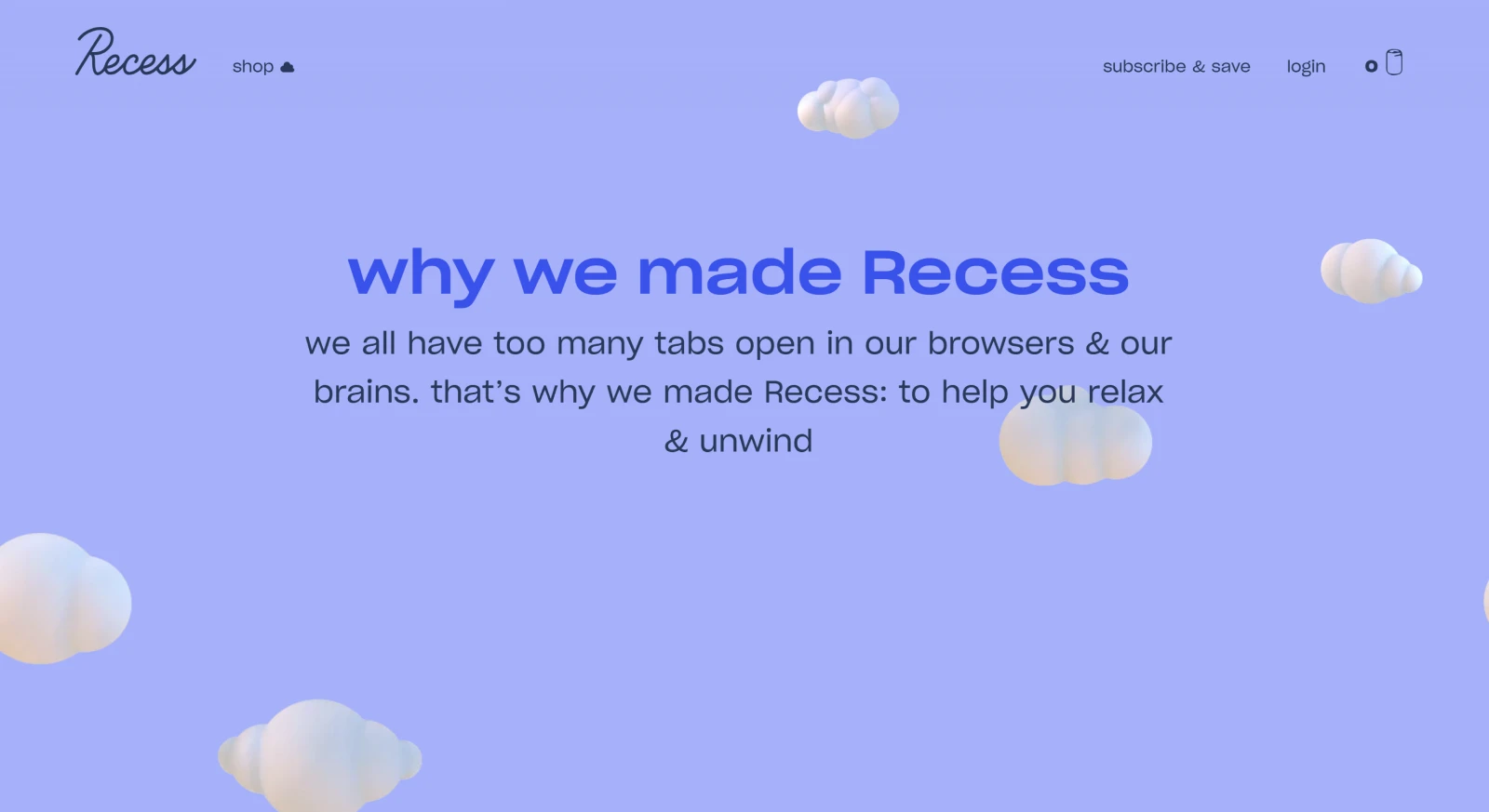
What works: The design communicates calm. Floating clouds, pastel colors, and copy that’s minimal and mood-based —the entire experience reflects the benefit of the product: chill out.
Steal this idea: Match your visual aesthetic to your product benefit. Pick one emotion you want your visitor to feel, and design your color palette, font, and layout around it.
7. Clickup
✅ Clear focus✅ Visual storytelling✅ Trust
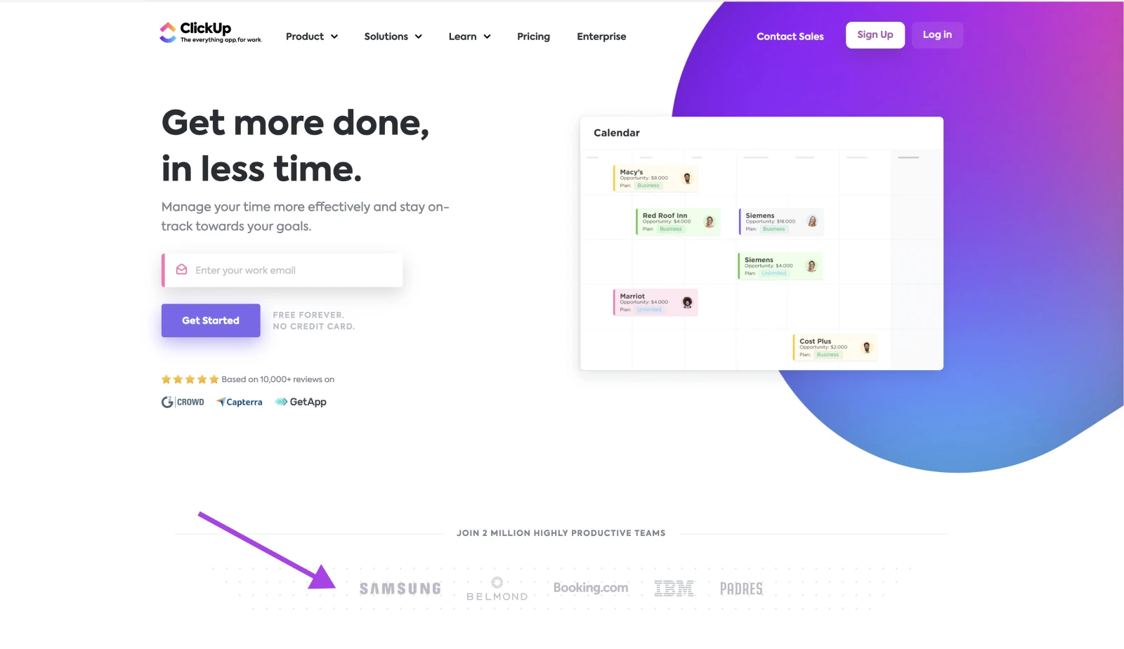
What works: ClickUp has short video modules embedded throughout, with each one showing how ClickUp can streamline a specific task. It also shouts out big brands who use the product, helping boost trust above the fold.
Steal this idea: Break down your product into use cases and show each one visually. Even a simple screencast can help demonstrate a benefit. Aim for <30 seconds per feature.
8. Ugmonk Gather
✅ Visual storytelling✅ Value prop✅ Clear focus
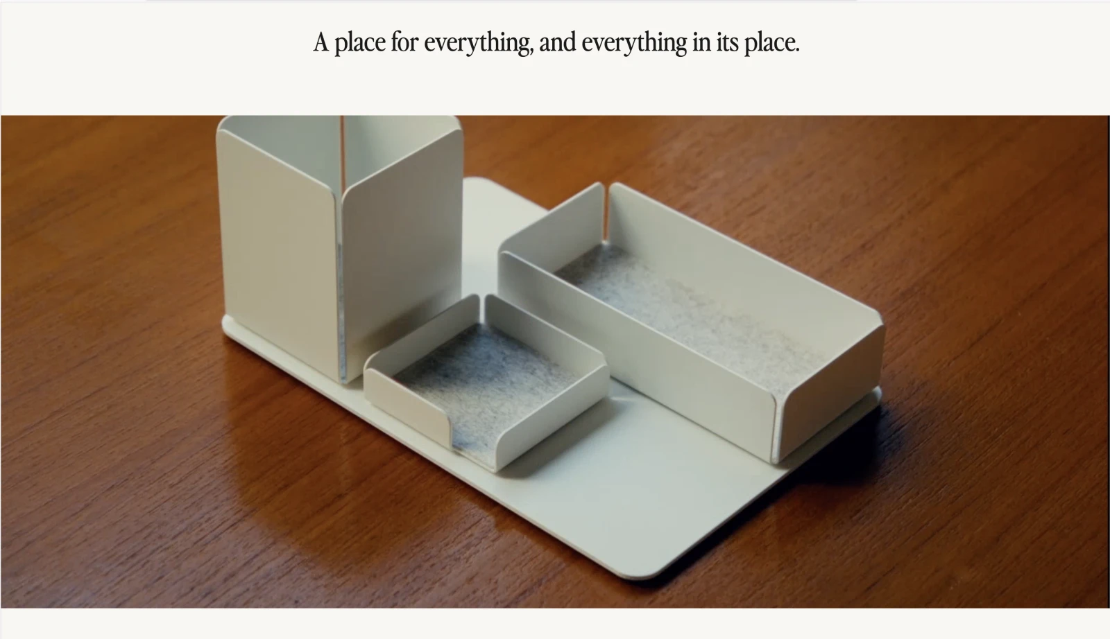
What works: This page uses minimalism to sell minimalism. The video demos are short, and the copy addresses clutter-related frustration. Everything reflects the value prop: a tidier desk.
Steal this idea: Let your design reinforce your product message. Alternatively, avoid clutter in your landing page. Stick to two fonts, one or two colors, and clear, repeatable spacing.
9. Hilma
✅ Value prop✅ Trust boosters✅ Clear focus
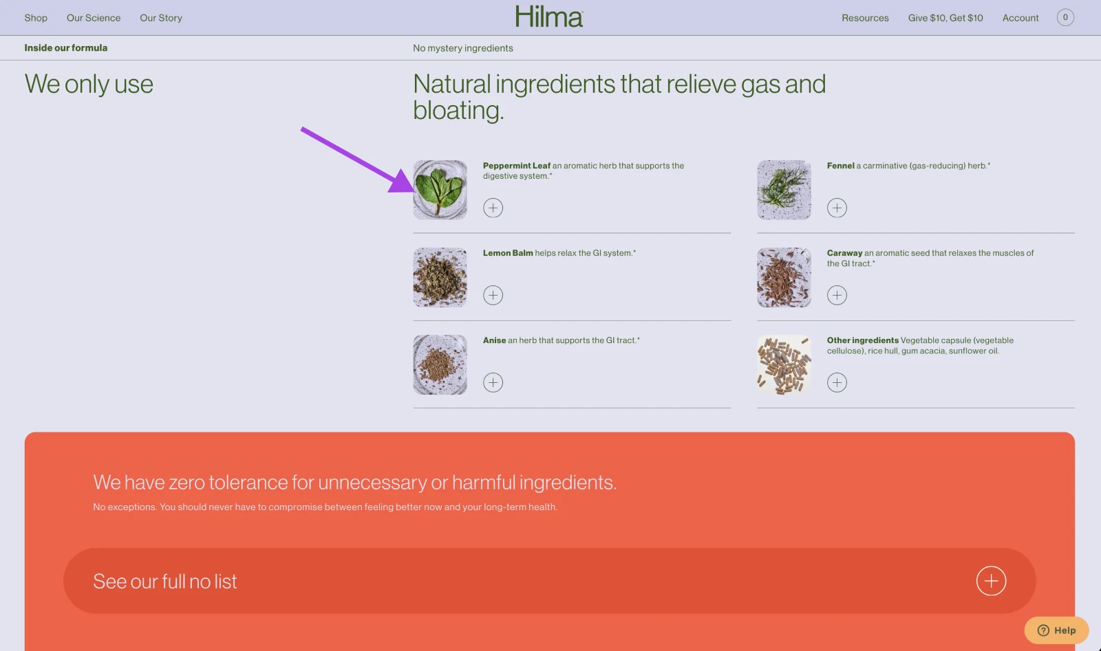
What works: Hilma explains its product using clean icons, a bold red “no list” for unwanted ingredients, and a tone that balances science with natural wellness. It’s easy to scan and understand what you’re getting —and not getting.
Steal this idea: Use visuals to explain both what’s included and what’s left out. If your product has “free-from” claims (for example, gluten, preservatives, or dyes), call those out in a colorful, skimmable format.
10. Draggable
✅ Visual storytelling✅ Clear focus
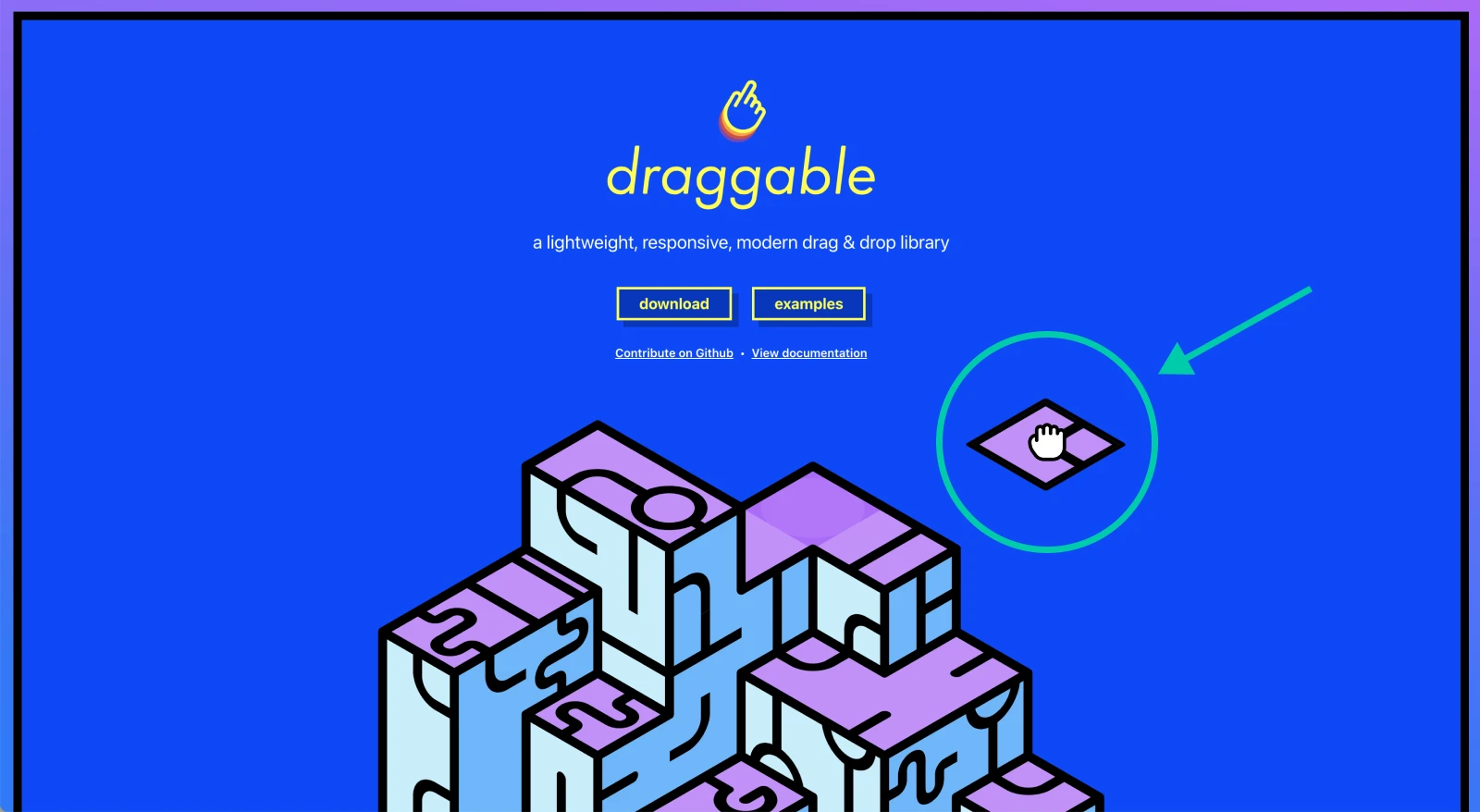
What works: The product is the demo. You land on the page, and you’re dragging elements within seconds. No need for lengthy descriptions, it’s self-explanatory and satisfying.
Steal this idea: Make your product demo the centerpiece of the page. Can’t code a live demo? Use screen recordings or animations to simulate the interaction.
11. Burrow
✅ Visual storytelling✅ Value prop
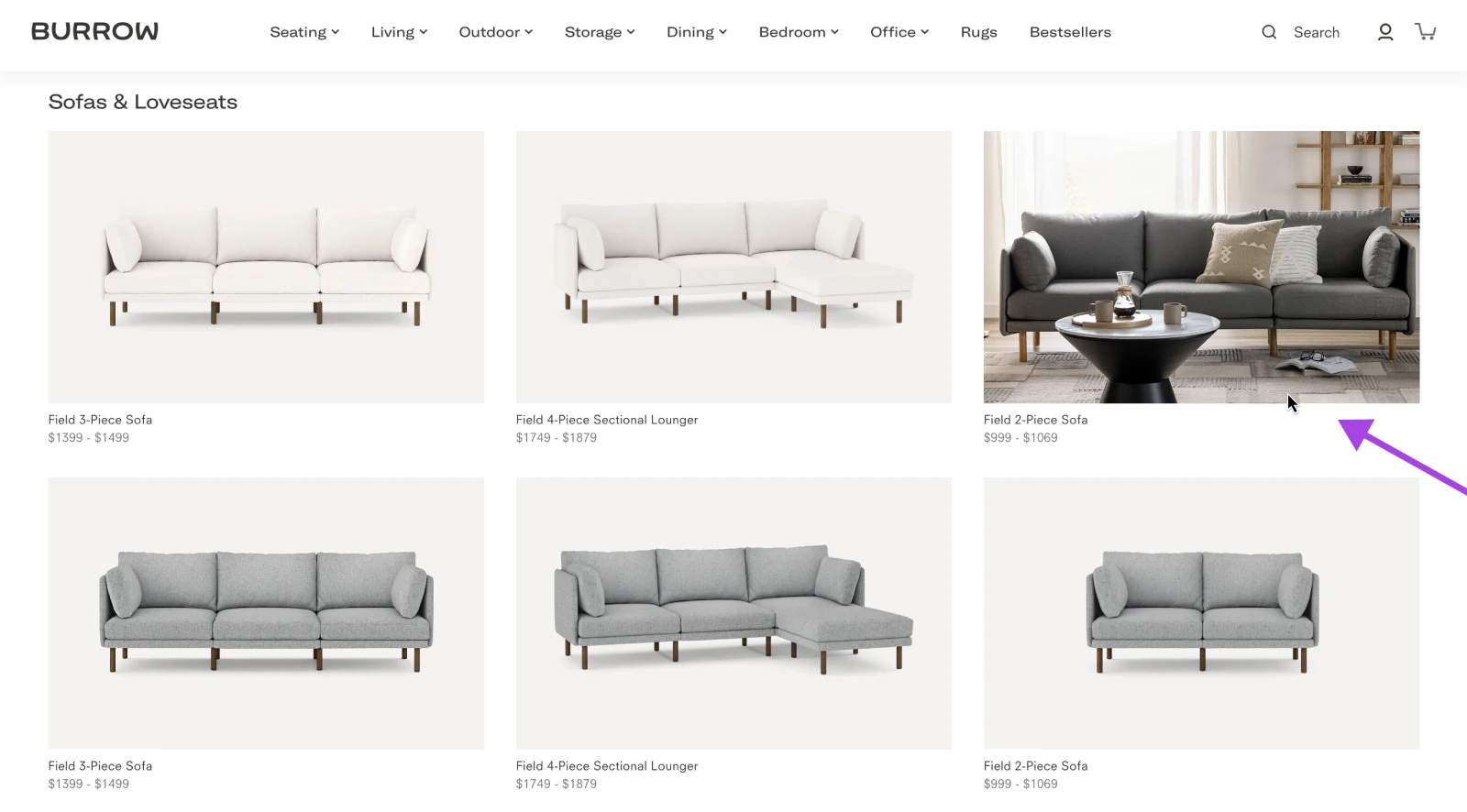
What works: Lifestyle imagery places the sofa in real-world settings. Every scroll gives you a different configuration, making it easy to imagine how it fits into your life. The modularity message is consistent throughout.
Steal this idea: Can’t afford lifestyle photoshoots? Use customer-generated content or create mockups instead.
12. Magic Spoon
✅ Value prop✅ Trust boosters
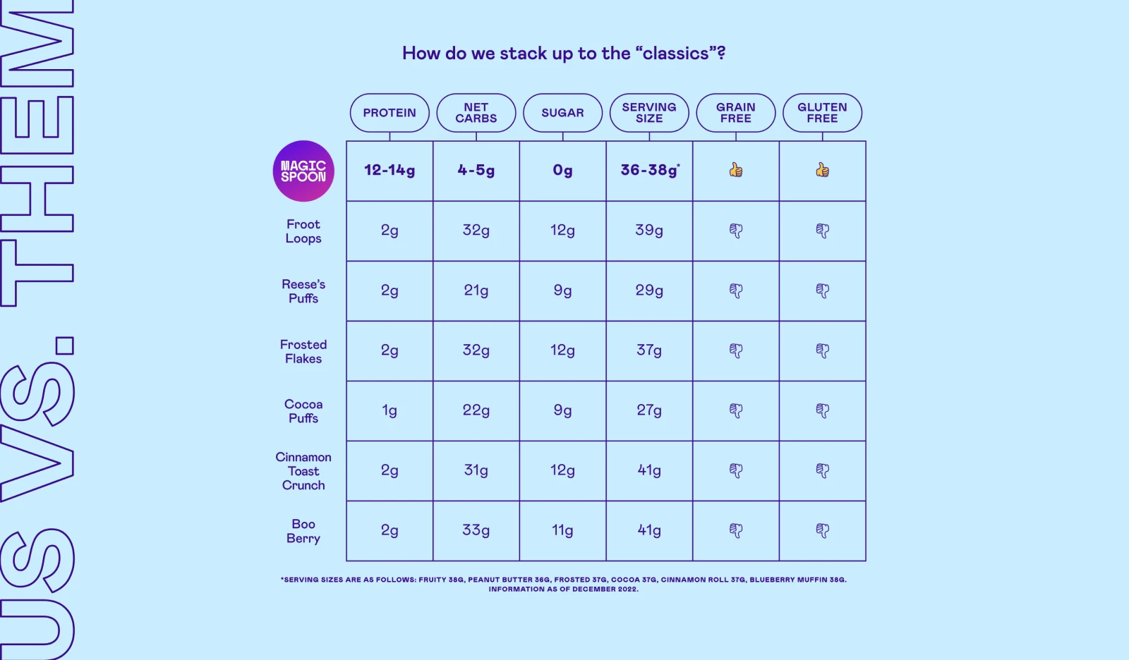
What works: Magic Spoon takes a direct approach: Their cereal is better than yours, and here’s why. An easy-to-read chart compares their macros to mainstream cereal brands, and playful packaging draws you in.
Steal this idea: Use comparison charts to show how you outperform the status quo. Even a simple table can add huge credibility. List “you vs. them” side-by-side to build trust with potential new customers.
13. Kettle & Fire
✅ Trust boosters✅ Clear focus
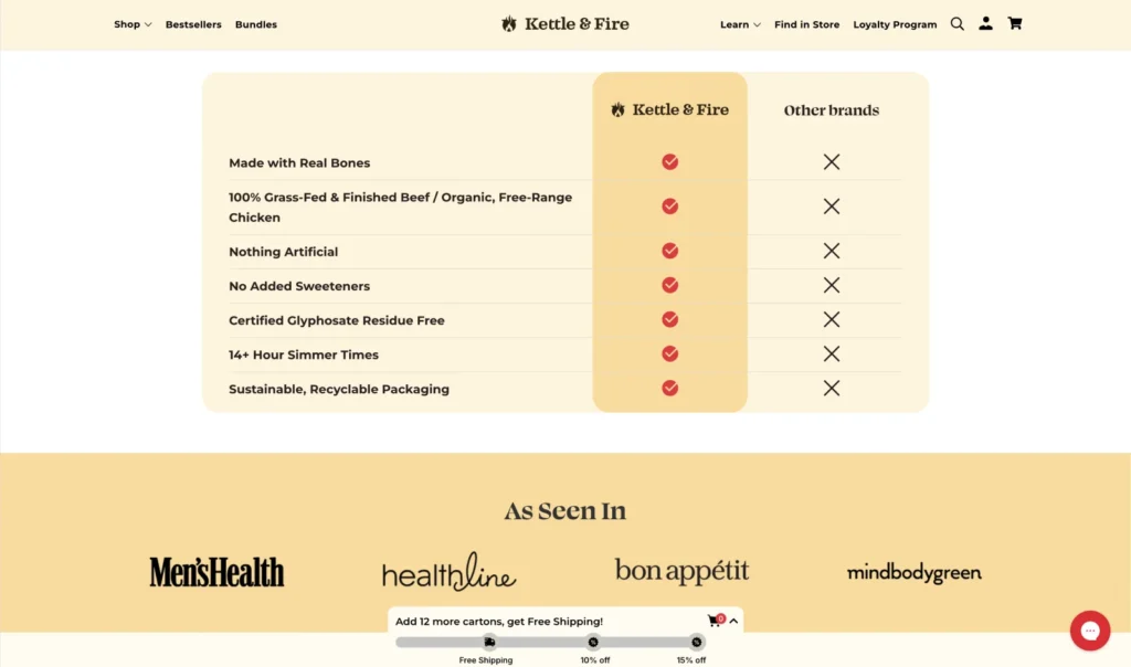
What works: Ingredient transparency, press mentions, and health claims are central here. The page makes something as old-school as bone broth feel modern, delicious, and premium.
Steal this idea: Lead with product credibility. Don’t underestimate a quote from a satisfied customer or health professional, which can carry serious weight, even in a crowded niche.
14. Beardbrand
✅ Value prop✅ Visual storytelling
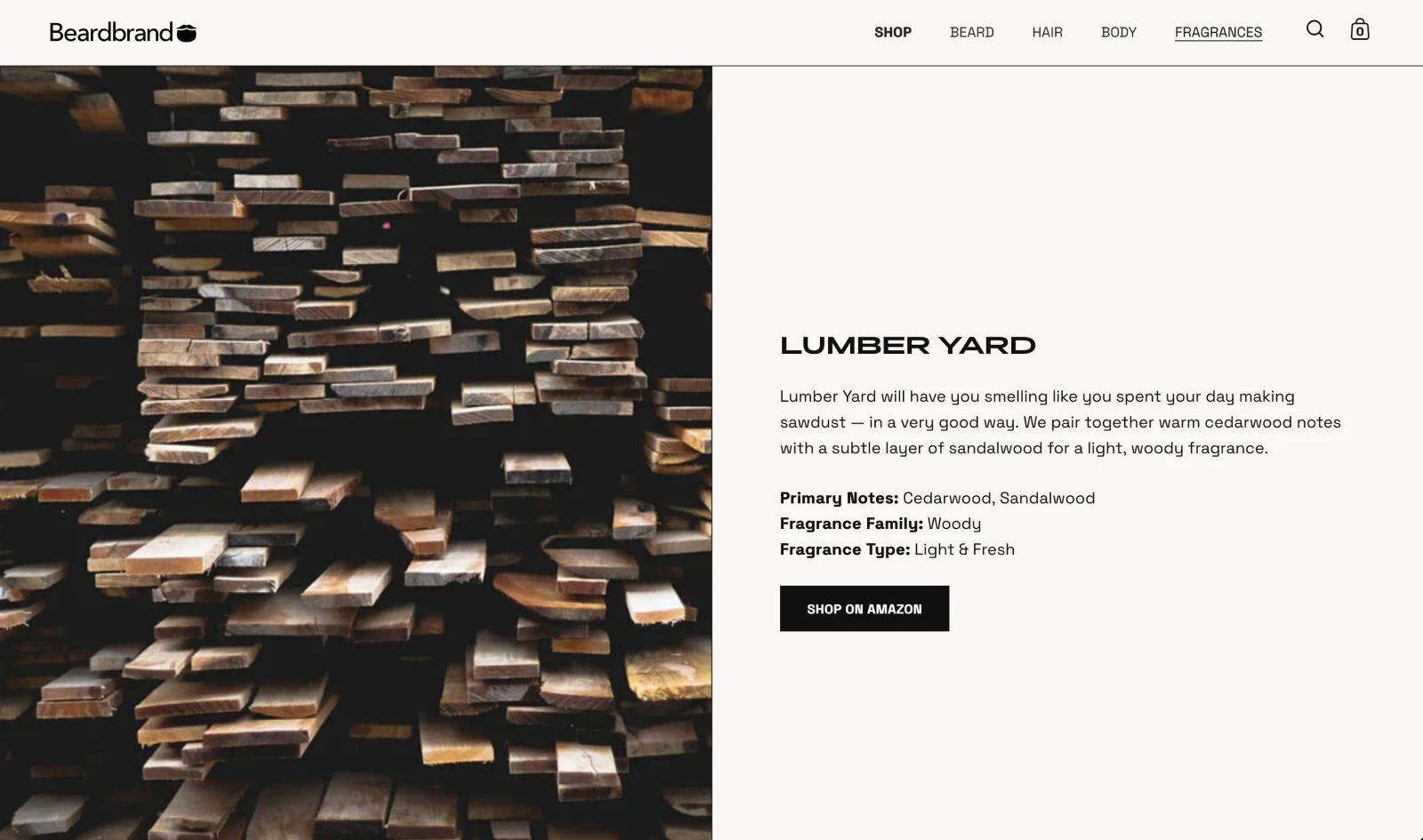
What works: Beardbrand sells scent, without smell-o-vision. So instead, they use descriptive storytelling, moody imagery, and a no-risk return policy to bring the experience to life. Every section adds dimension to the product line.
Steal this idea: If your product is hard to explain digitally, lean into narrative and visuals. Write sensory-rich descriptions that help customers imagine your product IRL.
15. Framer
✅ Visual storytelling✅ Value prop
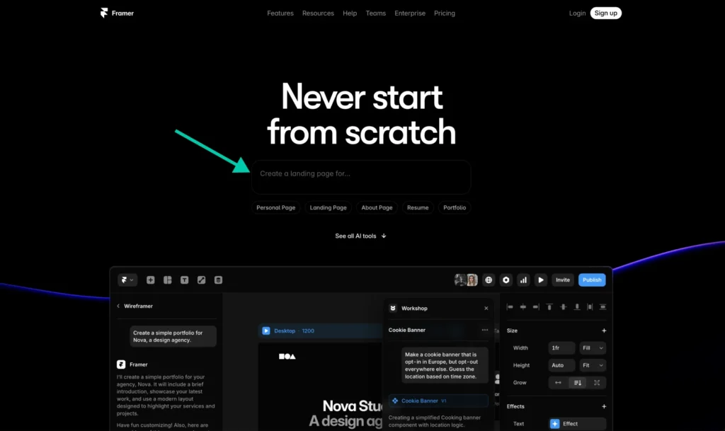
What works: You can generate a landing page from the landing page. Framer leads with a live demo and short explainer text, because sometimes it’s better to show than tell.
Steal this idea: Let your product prove itself instantly. If you offer a free trial or builder tool, let people use it right from the page —no sign-ups or other gatekeeping.
So, What Should Your Landing Page Look Like?
Here’s where things get a little more complicated, because there’s no one-size-fits-all template.
Best practices are actually kind of contradictory, because great product landing pages are shaped by the product itself, your brand’s personality, and most importantly —your audience.
Here’s how to find your fit and turn it into something you can actually build:
1. Understand Your Product Type and User Intent
- If your product is complex or new: Start with education. Think tutorials, FAQs, or demo videos.
- If your product is visual: Let photos or videos take the lead.
- If your product is emotionally driven (like in the beauty, fashion, or lifestyle categories): Use color, design, and story to build a vibe.
Try this: Write down the one action you want visitors to take. That’s your north star. Every element of the page should guide people toward that action.
2. Decide What Trust Signals Matter Most
- If you’re a new brand: Feature customer testimonials and media mentions front and center.
- If you’re an established business: Show off social proof, big-name customers, or certifications.
- If your product asks for a subscription or another type of long-term commitment: Reinforce guarantees, refund policies, or sample kits to lower the risk involved.
Try this: Ask three happy customers to write a short review about their experience. Include those reviews (with a friendly headshot, if possible) to humanize the feedback.
3. Choose Your Structure
There are a few landing page “archetypes” to consider:
- The explainer has features like a clear headline, video demo, and bulleted list of benefits.
- The storyteller has features like a hero image, narrative copy, testimonials, and an emotional CTA.
- The visual showcase has features like minimal copy, big images or videos, and a product-focused layout.
Try this: Sketch out your structure before opening your website builder. Boxes, arrows, chicken scratches — it all helps formulate a plan.
4. Use Tools That Make Execution Easy
You don’t need to hire a designer to build something beautiful. WordPress users can install page builders that allow them to drag, drop, and customize. No coding knowledge necessary.
Try this: DreamHost WordPress hosting plans come with a free AI website builder so you can bring your vision to life in under a minute—with no coding, design experience, or other expert knowledge required.
Ready To Launch? DreamHost Can Help
You’ve got ideas, examples, and a plan. Now it’s time to put pixels to page.
Whether you’re building your very first landing page or redesigning one that never quite worked, DreamHost has tools to help you bring it to life:
It’s time to start building. Your best landing page is just a few clicks away.

Pro Services – Web Design
DreamHost Makes Web Design Easy
Our designers can create a gorgeous website from SCRATCH to perfectly match your brand and vision — all coded with WordPress so you can manage your content going forward.
Learn More
Did you enjoy this article?