


Aspect ratios are crucial in design as they influence how content is displayed across various devices. Understanding and using the right aspect ratios can enhance user experience by ensuring visuals fit well and maintain quality. Current trends include responsive design, which adjusts layouts based on screen size, and the increasing use of variable ratios for different platforms, especially in social media. Future developments will focus on flexibility, accessibility, and the integration of technologies like augmented and virtual reality, making it essential for designers to adapt their strategies to create engaging and effective content.
Have you ever thought about how aspect ratios influence your experience on the web? They shape not just what you see, but how you feel about it. Let’s dive into this fascinating topic!
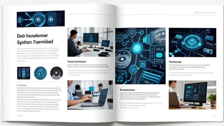
Introduction to Aspect Ratios
Aspect ratios are essential in design. They define how images and videos fit within a space. The most common aspect ratios are 16:9, 4:3, and 1:1. Each ratio affects how we view content. For instance, 16:9 is popular for videos, while 1:1 is great for social media posts.
Understanding aspect ratios helps designers create better layouts. It ensures that visuals look good on different devices. Whether it’s a smartphone or a large monitor, the right aspect ratio keeps everything in balance. This balance is crucial for user experience.
When using images, the aspect ratio can change the focus. A wider image might show more context, while a square image can draw attention to details. Designers must choose wisely based on the message they want to convey.
Aspect ratios also play a role in branding. Companies often use specific ratios to maintain a consistent look. This consistency helps build brand recognition. For example, a brand might always use a 16:9 ratio for its video ads.
In web design, aspect ratios influence how content is displayed. A well-chosen ratio can enhance readability and engagement. It can make a website feel more inviting. On the other hand, a poor choice can lead to awkward layouts and frustrated users.
As technology evolves, aspect ratios are changing too. With the rise of mobile devices, designers are adapting to new standards. This means being flexible and ready to adjust ratios for different screens.
In summary, aspect ratios are a key element in design. They affect how we perceive content and interact with it. By understanding and applying the right ratios, designers can create more effective and engaging experiences.
The Importance of Aspect Ratios in Design
Aspect ratios are crucial in design. They help determine how images and videos appear on screens. A good aspect ratio can make content more appealing. It also ensures that visuals fit well in different formats. For example, a 16:9 ratio is standard for videos. This ratio works well on most devices, from TVs to smartphones.
Using the right aspect ratio can enhance user experience. When images fit correctly, they look better and are easier to view. This is especially important for websites. If a photo is stretched or squished, it can lose its impact. Users may find it hard to engage with poorly displayed content.
Aspect ratios also affect how information is presented. For instance, in presentations, a 4:3 ratio can be more effective for slides. This ratio allows for more text and visuals without overcrowding. It helps keep the audience focused on the key points.
In branding, aspect ratios play a role too. Companies often use specific ratios in their logos and marketing materials. This consistency helps build brand identity. When customers see a familiar aspect ratio, they instantly recognize the brand.
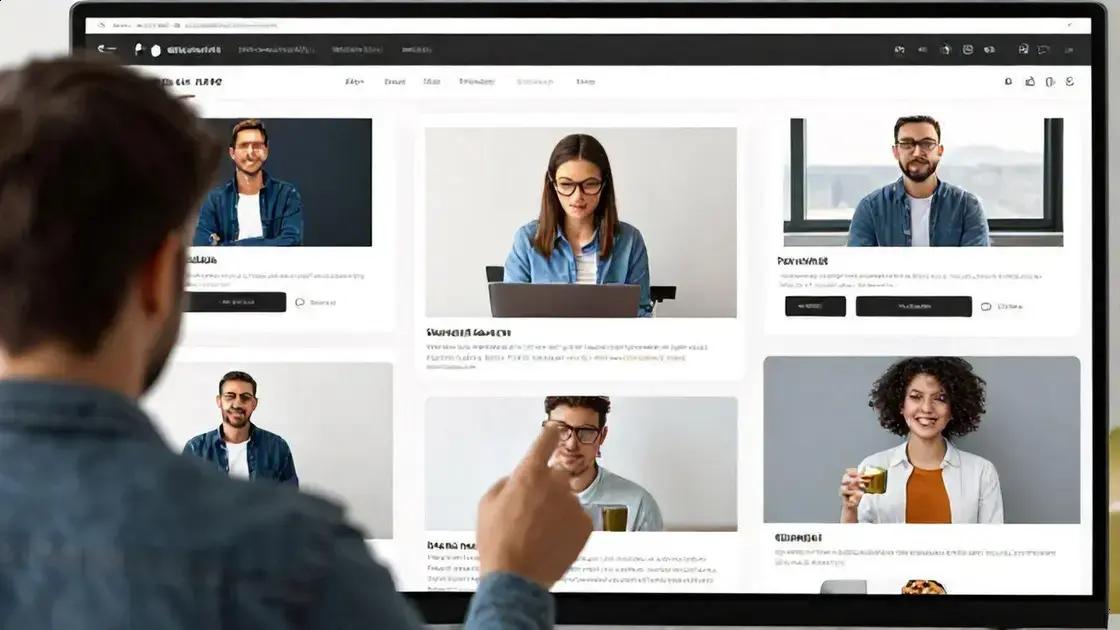
Designers must consider the context when choosing aspect ratios. Different platforms may require different ratios. Social media sites often favor square or vertical images. Understanding these preferences can help designers create more effective content.
Moreover, aspect ratios can influence the emotional response of viewers. A wide image can create a sense of openness. In contrast, a tall image may feel more intimate. Designers can use these effects to enhance storytelling in their work.
As technology evolves, aspect ratios are changing too. New devices and formats are emerging. Designers need to stay updated on these trends. This flexibility allows them to adapt their work for various screens and audiences.
Understanding User Perception through Ratios
User perception is key in design. It shapes how people interact with content. Aspect ratios can greatly influence this perception. When a user sees an image or video, the ratio affects their experience. For example, a wide image can feel more expansive. It may create a sense of openness and freedom.
On the other hand, a tall image can feel more intimate. This can draw viewers in and create a personal connection. Designers need to think about these feelings when choosing ratios. The right choice can enhance engagement and keep users interested.
Different platforms have different needs. For instance, social media often favors square or vertical images. These formats are easier to view on mobile devices. Users scroll quickly, so a good aspect ratio can capture their attention faster.
Understanding user perception also means knowing your audience. Different groups may respond differently to various ratios. A younger audience might prefer bold, wide images. In contrast, a more mature audience may appreciate traditional formats. Designers should research their target audience to make informed choices.
Moreover, aspect ratios can affect readability. For text-heavy content, a 4:3 ratio may work better. It allows for more text without feeling cramped. This can help users absorb information more easily. Clear communication is essential for a positive user experience.
Designers can also use aspect ratios to guide user behavior. For example, a wide banner at the top of a page can lead users’ eyes to important information. This technique helps prioritize content and enhances navigation.
In summary, understanding user perception through ratios is vital. It can make a big difference in how content is received. By considering how aspect ratios affect feelings and engagement, designers can create better experiences for their users.
Cultural Impact of Aspect Ratios
Aspect ratios have a significant cultural impact on how we view media. Different cultures may prefer different formats. For example, in Western countries, the 16:9 aspect ratio is common for videos. This wide format is used in movies and television. It creates a cinematic feel that many viewers enjoy.
In contrast, some Asian cultures may favor different ratios for their media. The 4:3 ratio is often used in traditional television shows. This format can feel more familiar and comfortable for viewers. Understanding these preferences is important for designers and content creators.
Aspect ratios also affect storytelling. A wider ratio can allow for more expansive scenes. This can enhance the storytelling experience. For instance, epic landscapes in films look stunning in a 16:9 format. It draws viewers into the story and creates a sense of immersion.
On the other hand, a square or vertical format can focus attention. These ratios are often used in social media. They cater to mobile users who scroll quickly. This format helps capture attention in a crowded feed. Designers must consider these cultural differences when creating content.
Moreover, aspect ratios can influence how people perceive brands. A brand that uses a consistent aspect ratio can build recognition. This recognition is vital in a global market. Companies need to adapt their content to fit cultural norms while maintaining their identity.
In advertising, the right aspect ratio can enhance the message. For example, a wide banner ad can create a bold statement. It may attract more clicks than a standard-sized ad. Advertisers must think about their audience’s cultural background when designing these ads.
As technology evolves, aspect ratios continue to change. New devices and platforms emerge, influencing how we consume media. Designers need to stay updated on these trends. This adaptability allows them to create content that resonates across cultures.
Modern UI Systems and Aspect Ratios
Modern UI systems rely heavily on aspect ratios. They help create layouts that look good on all devices. Designers must consider how content displays on various screens. For example, a mobile phone has a different aspect ratio than a desktop monitor. This difference can change how users interact with the content.
Aspect ratios in UI design can affect usability. A common ratio is 16:9, often used in videos. This ratio works well for wide screens. However, mobile devices often use a 9:16 ratio for vertical content. This is important for apps and social media platforms.
Using the right aspect ratio ensures that images and videos fit well. It prevents distortion, which can make content hard to view. For instance, a stretched image can look unprofessional. Users may quickly lose interest if visuals are not appealing.
Designers also use aspect ratios to guide user behavior. A wider layout can draw attention to key features. It can create a sense of space and openness. On the other hand, a narrow layout can focus users on specific tasks. This can enhance the overall user experience.
Responsive design is another important aspect of modern UI systems. This means that layouts adjust based on the device’s screen size. Designers use flexible grids and images to achieve this. Aspect ratios play a key role in making these adjustments seamless.
Many modern UI frameworks support various aspect ratios. This allows developers to create adaptive interfaces. For example, Bootstrap and Material Design offer guidelines for aspect ratios. These frameworks help ensure that designs look great on any device.
In addition, aspect ratios can enhance accessibility. A well-chosen ratio can make content easier to read. It can also help users with visual impairments. By providing clear visuals, designers can create a more inclusive experience.
Overall, understanding modern UI systems and aspect ratios is vital. They work together to create engaging and user-friendly designs. By considering these factors, designers can improve how users interact with their content.
Creating Rhythm and Flow with Ratios
Creating rhythm and flow in design is essential for engaging users. Aspect ratios play a key role in achieving this. When designers use the right ratios, they can guide the viewer’s eye smoothly across the page. This helps create a visual rhythm that keeps users interested.
Using consistent aspect ratios can help establish a pattern. For example, if images on a website all share the same ratio, it creates harmony. This harmony makes the layout feel balanced. Users can navigate the content more easily when everything fits together well.
Incorporating varying ratios can also add interest. For instance, mixing wide and narrow images can create dynamic layouts. This contrast can draw attention to specific elements. It can make important information stand out. Designers can use this technique to highlight calls to action or key messages.
Aspect ratios can influence how users perceive time and space. A wider ratio can create a sense of openness. This can make users feel relaxed and comfortable. On the other hand, a taller ratio can feel more intimate. This can encourage users to focus on the content presented.
Designers should also consider the flow of information. A well-planned layout using aspect ratios can guide users through the content. For example, a series of images with the same ratio can lead the eye from one section to another. This flow helps users absorb information without feeling overwhelmed.
In mobile design, aspect ratios are especially important. Many users access content on their phones. A good ratio can enhance readability and engagement. Designers should ensure that text and images fit well on smaller screens. This makes it easier for users to interact with the content.
Moreover, rhythm and flow can affect user emotions. A well-designed layout can evoke feelings of joy or excitement. By using aspect ratios thoughtfully, designers can create a positive experience. This can lead to higher satisfaction and increased time spent on the site.
Overall, creating rhythm and flow with aspect ratios is vital in design. It enhances user experience and keeps visitors engaged. By understanding how to use ratios effectively, designers can create visually appealing and functional layouts.
Future Trends in Aspect Ratio Design
Future trends in aspect ratio design are exciting and evolving. As technology advances, so do the ways we display content. Designers must stay updated on these changes to create effective visuals. One major trend is the rise of variable aspect ratios. This means using different ratios for different devices and contexts.
For example, social media platforms often favor vertical videos. This format works well on mobile devices, where users scroll quickly. On the other hand, widescreen formats are still popular for movies and television. Designers need to adapt their content to fit these varying preferences.
Another trend is the use of responsive design. This approach allows layouts to adjust based on screen size. Designers can create flexible grids that change dimensions while maintaining visual appeal. This ensures that content looks good on any device, from smartphones to large monitors.
Additionally, augmented reality (AR) and virtual reality (VR) are shaping aspect ratio design. These technologies often require unique ratios to create immersive experiences. For instance, a VR headset might use a 16:9 ratio for a wide field of view. Designers must consider these factors when creating content for AR and VR environments.
Moreover, the demand for high-quality visuals is increasing. Users expect crisp, clear images and videos. This means designers must choose aspect ratios that enhance quality while fitting the content. A well-chosen ratio can improve the overall viewing experience.
There’s also a growing focus on accessibility in design. Aspect ratios can play a role in making content more accessible. For example, using a 4:3 ratio for text-heavy layouts can improve readability. Designers should always consider how their choices affect all users.
As we look to the future, sustainability is becoming important in design. This includes creating content that minimizes waste. Aspect ratios can help by ensuring that visuals fit well in various formats. This reduces the need for resizing and reformatting, saving time and resources.
In summary, future trends in aspect ratio design will focus on flexibility, responsiveness, and quality. Designers must embrace these changes to create engaging and effective content. By staying informed, they can adapt to the ever-changing landscape of digital media.