


Authenticity in modern web design focuses on creating genuine connections with users. It emphasizes storytelling, transparency, and the use of real images to reflect a brand’s true identity. Incorporating user-generated content and maintaining a consistent brand voice enhances trust and loyalty. Simple, clean designs also contribute to an authentic user experience, making brands more relatable and trustworthy in the digital landscape.
Have you ever wondered why the 90s web still holds a special place in our hearts? It was a time of chaotic creativity and personal expression that many designers miss today. Let’s dive into this digital nostalgia!
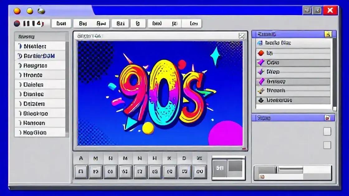
The Chaotic Charm of the 90s Web
The 90s web was a wild and exciting place. It was a time when anyone could create a website, and creativity ran free. Websites were often colorful and chaotic, with bright backgrounds and clashing fonts. This unique style made browsing the internet feel like an adventure.
Back then, web design was not about minimalism. Instead, it was about expression. Many sites featured animated GIFs, flashy banners, and even music that played automatically. This made the web feel lively and fun. Every click could lead to a surprising new design or a quirky animation.
One of the most memorable aspects of the 90s web was the use of frames. Frames allowed designers to display multiple sections of a page at once. This meant that you could have a navigation menu on one side while the main content loaded in another. While this might seem outdated now, it was a popular way to organize information.
Another hallmark of this era was the use of table layouts. Designers used tables to create complex page structures. This was a time-consuming process, but it allowed for creative layouts. Many sites had multiple columns and rows, creating a grid-like appearance. It was all about making the site visually interesting.
As we look back, we can see how the 90s web paved the way for modern design. The chaos and creativity of that time taught us valuable lessons. Today, we often blend simplicity with creativity, but the spirit of the 90s still inspires many designers. Websites now focus on user experience, but the playful elements of the past still hold a special charm.
In conclusion, the chaotic charm of the 90s web reminds us of a time when the internet was new and full of possibilities. It was a playground for creativity, and many still cherish those early days. The bright colors, animated GIFs, and unique designs are a nostalgic reminder of how far we’ve come.
Skeuomorphism: A User-Friendly Illusion
Skeuomorphism is a design concept that mimics real-world objects. It helps users feel comfortable with digital interfaces. By using familiar shapes and textures, designers make apps and websites easier to use. For example, a digital notepad might look like a real notebook. This design choice makes it clear how to interact with it.
In the past, skeuomorphism was very popular. Many apps looked like physical items. Apple used this style in its early iOS designs. The calendar app had a leather texture, while the notes app looked like a yellow legal pad. These designs created a sense of warmth and familiarity.
However, as technology evolved, the trend shifted. Flat design became more popular. This style focuses on simplicity and minimalism. It removes unnecessary textures and shadows. While flat design has its benefits, some users miss the comfort of skeuomorphic elements. They feel that these elements provide a more engaging experience.
One of the main benefits of skeuomorphism is its ability to guide users. When a button looks like a physical button, users know to click it. This visual cue can reduce confusion. For example, a digital volume slider that looks like a real slider is more intuitive. Users can easily understand how to use it without instructions.
Despite its decline, skeuomorphism is not gone. Many designers still use it in subtle ways. They might add shadows or textures to buttons to create depth. This approach can make interfaces feel more dynamic and inviting. It’s all about finding the right balance between realism and simplicity.
In conclusion, skeuomorphism remains an important concept in design. It creates a user-friendly illusion that helps people navigate technology. As we move forward, blending skeuomorphic elements with modern design can offer the best of both worlds. Users appreciate designs that feel familiar while still being functional.
The Art of Table Layouts in Web Design
The art of table layouts in web design was a popular technique in the 90s. It allowed designers to organize content in a clear and structured way. Tables helped create multi-column layouts, which were essential for displaying information effectively. Each cell in a table could hold text, images, or links, making it a versatile tool.
Using tables made it easy to align elements on a page. For example, you could place a navigation menu on one side and content on the other. This setup was user-friendly and visually appealing. Many websites used this layout to create a balanced look.
However, table layouts had their downsides. They could be complex to manage, especially for larger sites. If a designer wanted to change the layout, it often required adjusting multiple tables. This made updates time-consuming. As web standards evolved, designers started to look for more flexible solutions.
With the rise of CSS (Cascading Style Sheets), designers found better ways to create layouts. CSS allowed for more control over design without relying on tables. It enabled the use of divs and other elements to structure content. This shift made web pages easier to maintain and more responsive to different screen sizes.
Even though table layouts are less common now, they taught valuable lessons. They showed the importance of organizing content effectively. Today’s designers still use some principles from table layouts. For instance, grid systems help create structured layouts while allowing for flexibility.
In summary, while table layouts may seem outdated, they played a crucial role in web design history. They helped shape how we think about organizing information online. Understanding their impact can inspire modern web design practices that prioritize clarity and usability.
The Return of Retro Aesthetics
The return of retro aesthetics in web design is a fascinating trend. Designers are looking back at styles from the past, especially the 90s. This nostalgia brings a unique charm to modern websites. Bright colors, bold fonts, and playful graphics are making a comeback.
Many people remember the excitement of the early internet. Websites were colorful and full of personality. Designers used animated GIFs and quirky layouts. This fun approach made browsing enjoyable. Today, many designers want to capture that spirit again.
Retro aesthetics can evoke feelings of nostalgia. They remind users of simpler times when the internet was new. This emotional connection can make a website more engaging. When users feel a connection, they are more likely to spend time on the site.
Using retro elements doesn’t mean ignoring modern design principles. It’s about blending the old with the new. For example, a website might use a retro color palette but maintain a clean layout. This combination can create a fresh look while honoring the past.
One popular retro trend is the use of pixel art. This style mimics the graphics of early video games. It adds a playful touch to websites. Pixel art can be used for icons, backgrounds, or even entire illustrations. This approach can attract users who appreciate the nostalgia of gaming.
Another aspect of retro aesthetics is typography. Designers are using bold, chunky fonts that were popular in the 90s. These fonts can add personality to a website. They stand out and grab attention, making the content more memorable.
Incorporating retro aesthetics can also enhance branding. A unique design can set a business apart from its competitors. It creates a distinct identity that resonates with users. This can be especially effective for brands targeting younger audiences who crave authenticity.
Overall, the return of retro aesthetics is a fun way to connect with users. It blends nostalgia with modern design, creating engaging experiences. As designers continue to explore this trend, we can expect to see more creative and playful websites in the future.
Authenticity in Modern Web Design
Authenticity in modern web design is becoming increasingly important. Users want to connect with brands that feel genuine. They appreciate honest designs that reflect a brand’s true identity. Authenticity can build trust and loyalty among customers.
One way to achieve authenticity is through storytelling. Websites that share their stories engage users. This could include the brand’s history, mission, or values. When users understand a brand’s journey, they feel more connected. This connection can lead to increased customer loyalty.
Another key aspect of authenticity is transparency. Brands should be open about their practices. This includes how they source materials or treat employees. Users appreciate brands that are honest about their operations. Transparency can help build a strong reputation and foster trust.
Design elements also play a role in creating an authentic experience. Using real images of people and products can make a website feel more relatable. Stock photos can seem impersonal. Authentic images reflect the brand’s true essence. They help users feel a personal connection to the brand.
Additionally, incorporating user-generated content can enhance authenticity. This includes reviews, testimonials, and social media posts from real customers. When potential customers see others enjoying a product, they are more likely to trust the brand. It shows that the brand is valued by real people, not just marketing efforts.
Moreover, a consistent brand voice across all platforms is essential. Whether on social media, email, or the website, the tone should be the same. This consistency helps reinforce the brand’s identity. Users will recognize and trust the brand more when it feels cohesive.
Finally, simplicity in design can also convey authenticity. A cluttered website can distract users from the message. Clean, straightforward designs allow users to focus on what matters. This approach shows that the brand values the user’s experience.
In summary, authenticity in modern web design is crucial for building trust and loyalty. By sharing stories, being transparent, using real images, and incorporating user-generated content, brands can create genuine connections. A consistent voice and simple design further enhance this authenticity, making the brand more relatable and trustworthy.