


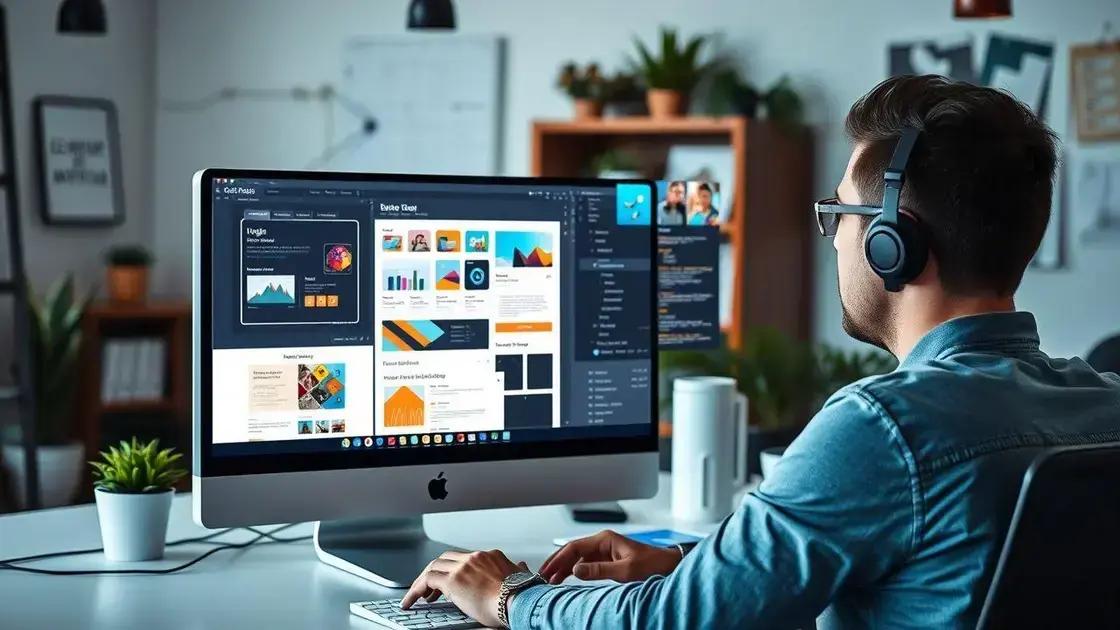
In 2025, web design is fundamentally shifting towards dynamic and adaptive digital environments, moving beyond fixed layouts to create fluid, responsive interfaces that seamlessly adjust to any device. This evolution emphasizes the critical role of user trust and digital hospitality, ensuring websites are not only functional but also empathetic and welcoming. Artificial Intelligence (AI) is increasingly shaping design practices by automating tasks and enabling smarter, personalized user experiences, while the interdisciplinary nature of modern web design demands collaboration among diverse specialists to craft truly engaging and effective online presences.
Web Design in 2025 is not merely about aesthetics; it embodies the creation of dynamic user experiences. Today, developers must cultivate digital spaces that adapt and respond to user needs. This evolving landscape emphasizes the significance of empathy and innovation, appealing to a diverse audience. Interested in how these elements intertwine to enhance user interaction? Let’s delve deeper!
The Shift from Traditional to Dynamic Design
Remember when websites looked pretty much the same on every computer? That was the era of traditional web design. Back then, designers created fixed layouts. These layouts worked fine for desktop screens, which were mostly uniform. But times have changed a lot since then. People now use all sorts of devices to browse the internet. Think about smartphones, tablets, and even smartwatches. A fixed design just doesn’t cut it anymore.
This is where the big shift to dynamic design comes in. Dynamic design means websites can change and adapt. They look good and work well on any screen size. It’s like a chameleon, always adjusting to its environment. This change wasn’t just a fancy new idea. It became a must-have. Users expect a smooth experience, no matter what device they’re holding. If a site is hard to use on a phone, people will quickly leave.
Why Dynamic Design Matters Now
The rise of mobile devices truly pushed this change. Suddenly, designers had to think beyond the desktop. They needed to make sure content was easy to read and buttons were easy to tap. This led to responsive web design, a key part of dynamic design. Responsive sites automatically resize and rearrange elements. This ensures everything fits perfectly, from a tiny phone screen to a huge monitor. It’s all about making the user’s life easier.
Beyond just fitting screens, dynamic design also focuses on user interaction. It’s about creating an engaging experience. This might involve interactive elements or personalized content. The goal is to keep visitors interested and happy. A good dynamic site feels intuitive. It guides the user naturally through information. This helps businesses connect better with their audience. It also improves how long people stay on a site.
This shift also has big benefits for search engines. Google, for example, favors websites that are mobile-friendly. So, having a dynamic design can actually help your site show up higher in search results. It’s not just about looking good; it’s about performing well too. Embracing dynamic design means staying relevant. It means offering the best possible experience to everyone who visits your site. This is crucial for success in today’s digital world.
Creating Adaptive Digital Environments
Think about how websites used to be. They were pretty much the same for everyone. But today, things are much smarter. We’re talking about creating adaptive digital environments. This means websites and apps that can change. They adjust to who you are, what device you’re using, and even where you are. It’s like the website knows you a little bit.
This isn’t just about making a site fit your phone screen. That’s called responsive design, and it’s a good start. But adaptive environments go further. They might show you different content if you’re a new visitor versus a returning one. Or they could suggest products based on what you’ve looked at before. It makes your online experience feel more personal and helpful. It’s all about making things easier for you.
Why Adaptive Environments Help Users
When a website adapts, it makes using it much smoother. Imagine you’re on a shopping site. If it remembers what you like, it can show you those items first. This saves you time and effort. It also makes you feel like the site understands your needs. This kind of thoughtful design builds trust. Users are more likely to stay longer and come back again. They feel valued, not just like another visitor.
These environments also consider your device. Maybe you’re on a tablet at home, or a laptop at work. The site will adjust its layout and features to work best for that device. It might simplify menus on a smaller screen. Or it could offer more detailed options on a larger one. The goal is always to give you the best view and easiest way to interact. This flexibility is key in our multi-device world.
Building these adaptive spaces takes smart thinking. Designers use data to understand user behavior. They look at what people click on, how long they stay, and what they search for. This information helps them create experiences that truly fit. It’s a continuous process of learning and improving. The digital world is always changing, so our websites need to change with it. This ensures everyone gets a great online experience, every time.
Importance of User Trust and Digital Hospitality
Imagine walking into a store where everyone is friendly and helpful. You’d feel welcome, right? The same idea applies to websites. It’s all about digital hospitality. This means making visitors feel safe and respected when they’re online. A good website isn’t just about pretty pictures. It’s about creating a welcoming space where people feel comfortable exploring and sharing information. This feeling of welcome is super important for any online business or service.
At the heart of digital hospitality is user trust. People won’t stick around if they don’t trust your site. They need to know their information is safe. They also want to feel that you care about their experience. Building this trust takes effort. It means being open and honest about how your site works. It also means making sure everything runs smoothly. When users trust you, they’re more likely to come back. They might even tell their friends about your great site.
Building Trust Through Transparency
So, how do you build this trust? One big way is through transparency. This means being clear about your privacy policy. Tell users what data you collect and why. Make it easy to understand, not hidden in tiny print. Also, always use secure connections, like HTTPS. You can usually spot this with a little padlock icon in your browser. This shows users their data is encrypted and safe. Being upfront and secure makes a huge difference.
Good digital hospitality also means making the site easy to use. No one likes getting lost or confused. Clear navigation, helpful error messages, and quick loading times all play a part. It’s about anticipating what users need and providing it. Think of it as a friendly guide. When a site is intuitive, users feel more in control. This positive experience builds a stronger connection with your brand. It shows you value their time and effort.
Ultimately, user trust and digital hospitality are key to success online. They lead to happier customers and more loyal visitors. When people feel safe and welcome, they’re more likely to engage. They’ll buy products, read articles, or use your services. Investing in these areas isn’t just good manners. It’s smart business. It helps your site stand out in a crowded digital world. It makes people want to choose you.
The Role of AI in Shaping Design Practices
Artificial Intelligence, or AI, is changing many jobs, and web design practices are no different. Think of AI as a smart helper that can make a designer’s work easier and faster. It’s not about robots taking over creativity. Instead, AI tools are helping designers do their best work. They can handle the boring, repetitive stuff. This frees up designers to focus on the truly creative parts of their job. It’s a big step forward for how websites are made.
One major way AI helps is through automation. Imagine having a tool that can quickly create different layout options for a website. Or one that can suggest the best color palettes based on current trends. AI can do these things in seconds. This saves a lot of time that designers used to spend on manual tasks. It means they can try out more ideas. They can also finish projects faster. This makes the whole design process much more efficient.
AI for Smarter Design Decisions
AI also plays a big role in making designs more personal. It can analyze tons of user data. This data tells designers what people like, what they click on, and what makes them stay on a site. With this information, AI can help create websites that truly speak to each user. It can suggest content or layouts that are more likely to engage visitors. This leads to a much better experience for everyone online.
Another cool thing AI does is help with testing. It can run simulations to see how a design might perform. It can spot potential problems before a site even goes live. This means fewer errors and a smoother launch. AI can also help with accessibility. It can check if a site is easy for everyone to use, including people with disabilities. This ensures that good design is for all.
So, AI isn’t just a futuristic idea for designers. It’s a real tool being used right now. It helps create better, more personal, and more efficient websites. It lets designers be more creative by taking care of the routine work. This means the future of web design will be smarter, faster, and more focused on the user. It’s an exciting time to be in the world of digital creation.
Empathy and User Experience in 2025
In 2025, making websites and apps isn’t just about how they look. It’s really about how they make people feel. This is where empathy comes in. Empathy in design means truly understanding your users. It’s about putting yourself in their shoes. What do they need? What makes them happy or frustrated? When designers think this way, they create much better experiences. This focus on feelings is changing how we build digital tools.
The goal is a great user experience (UX). A good UX means a site is easy to use, helpful, and even enjoyable. But in 2025, it goes deeper. It’s about designing with a human touch. It’s about making sure technology serves people, not the other way around. This approach helps build trust. It makes users feel understood and valued. That’s a powerful connection in the digital world.
Why Empathy is Key for Digital Success
Think about a website that’s hard to navigate. Or an app that asks for too much personal info without explaining why. These things can make users feel annoyed or unsafe. An empathetic designer tries to avoid these problems. They think about the user’s journey from start to finish. They consider different types of users, too. This includes people with different abilities or those using various devices. Making a site accessible for everyone is a big part of empathetic design.
By 2025, businesses will see even more clearly that empathy pays off. When users have a positive experience, they’re more likely to stay on your site. They’re also more likely to buy your products or use your services. Happy users often become loyal customers. They might even tell their friends about your great site. This word-of-mouth is super valuable for any business.
So, how do designers practice empathy? They do things like user research. They talk to real people and watch how they use websites. They also create ‘user personas,’ which are like profiles of typical users. This helps them remember who they’re designing for. It’s a continuous process of listening and learning. The future of web design isn’t just about fancy tech. It’s about being truly human-centered. It’s about creating digital spaces that truly care.
The Interdisciplinary Nature of Modern Web Design
Making a great website today isn’t a one-person job. It’s a team effort, bringing together many different skills. This is what we mean by the interdisciplinary nature of modern web design. Think of it like building a house. You need architects, builders, plumbers, and electricians. Each person has a special job, but they all work together to create the final home. Web design is very similar. It needs people with different talents to make a successful site.
Gone are the days when a single designer could handle everything. Today’s websites are complex. They need to look amazing, work perfectly on any device, and be easy for everyone to use. They also need to be found by search engines and connect with people. This means designers often work with coders, content writers, marketing experts, and user experience (UX) specialists. It’s a mix of art, science, and human understanding.
Bringing Diverse Skills Together for Better Websites
For example, a visual designer makes the site look good. They pick colors, fonts, and images. But a user experience (UX) designer makes sure the site is easy to navigate. They think about how people will click around and find information. Then, a developer or coder builds the actual site. They write the code that makes everything work. These are very different skills, but they all have to fit together perfectly.
Content creators are also super important. They write the words you read on a website. Good content is clear, engaging, and helps people understand what your site is about. And let’s not forget about SEO (Search Engine Optimization) experts. They help make sure your website shows up high in search results. This means more people will find your site. All these roles contribute to the final product.
This teamwork approach leads to much better websites. When different experts share their knowledge, they can solve problems more creatively. They can also make sure the site meets many different needs. It’s not just about making something pretty. It’s about making something functional, accessible, and effective. This collaborative spirit is what makes modern web design so powerful and exciting. It ensures every aspect of the site is top-notch.
Crafting Fluid and Responsive Interfaces
Imagine a website that looks great on your big computer screen. Now, imagine that same website shrinking down perfectly to fit your phone. That’s what we mean by crafting fluid and responsive interfaces. It’s about making sure digital content flows smoothly. It adapts to any screen size or device you’re using. This isn’t just a nice-to-have anymore; it’s a must-have for any modern website.
Think about how often you use your phone or tablet to browse the internet. If a website is hard to read or click on your mobile device, you’ll probably leave, right? That’s why designers work hard to make sites responsive. They want to give you a great experience, no matter what device you have. This makes using the internet much easier and more enjoyable for everyone.
Why Responsive Design is Essential Today
The main idea behind responsive design is flexibility. Instead of making a separate website for every device, designers build one site that can change. They use special tools and techniques to make elements on the page adjust. Pictures might get smaller, and text might rearrange itself. This ensures everything looks neat and is easy to use, whether you’re on a tiny phone or a large desktop monitor.
One key technique is using flexible grids. Imagine your website layout as a grid. Instead of fixed sizes, these grids use percentages. So, a column might take up 50% of the screen, not a fixed number of pixels. This way, as the screen gets smaller, the column also shrinks proportionally. Images also need to be flexible. They should resize without losing quality or breaking the layout. This keeps the site looking professional on all devices.
Another important part is something called ‘media queries.’ These are like rules that tell the website how to act on different screen sizes. For example, a media query might say, ‘If the screen is smaller than 600 pixels, stack these two columns on top of each other.’ This helps designers fine-tune the experience for various devices. It ensures that buttons are big enough to tap on a phone and text is readable.
Having a fluid and responsive interface isn’t just good for users. It’s also great for businesses. Search engines like Google prefer websites that are mobile-friendly. So, a responsive site can actually help you rank higher in search results. This means more people will find your website. It also shows your visitors that you care about their experience. This builds trust and encourages them to stay longer. It’s a win-win for everyone involved in the digital world.