


Designing flexible card layouts is crucial for enhancing user experience across various devices. Flexibility ensures that your content adapts seamlessly to different screen sizes, making it accessible and engaging. By implementing responsive design principles and utilizing grid systems, you can create layouts that maintain usability and visual appeal. Testing different designs and gathering user feedback further optimizes these layouts, ensuring they meet user needs effectively. Overall, a well-designed flexible card layout can significantly improve interaction and satisfaction on your website.
Card Design plays a crucial role in shaping user experience. Understanding the differences between vertical and horizontal cards can enhance your design choices. Ready to dive in?
Introduction to Card Design
Card design is a popular way to present information online. It organizes content into bite-sized pieces. This makes it easy for users to scan and find what they need. Cards can hold images, text, and links. They are flexible and can fit many types of content.
What is Card Design?
Card design refers to a layout style that uses rectangular boxes to display information. Each card acts like a small window into a larger topic. For example, a news website might use cards to show different articles. Each card can include a headline, an image, and a summary. This layout helps users quickly find interesting content.
Why Use Cards?
Using cards has many benefits. First, they make content visually appealing. Users are more likely to engage with content that looks good. Second, cards help organize information. When content is grouped into cards, it’s easier to digest. Users can quickly scan through cards to find what they want.
Types of Card Designs
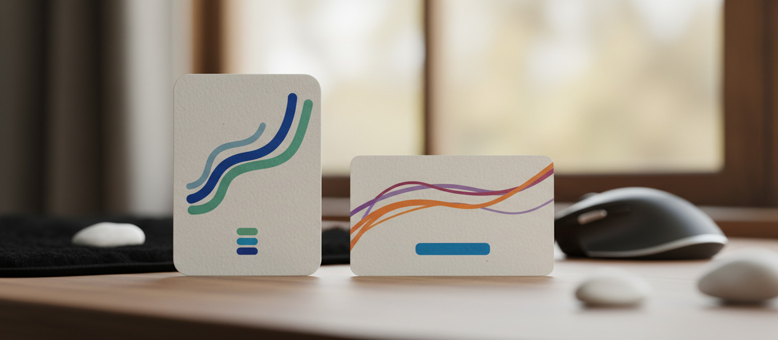
There are different types of card designs. Vertical cards are taller and often used for images and headlines. They work well for content that needs more space. Horizontal cards are wider and can show more text. They are great for summaries or lists. Choosing the right type depends on the content you want to display.
Best Practices for Card Design
When designing cards, keep a few best practices in mind. Use clear images that relate to the content. Make sure the text is easy to read. Use a consistent style across all cards to create a cohesive look. Also, ensure that cards are responsive. They should look good on both desktop and mobile devices.
In summary, card design is an effective way to present information online. It enhances user experience by making content more accessible and engaging. Whether you choose vertical or horizontal cards, focus on clarity and visual appeal. This will help users connect with your content more effectively.
The Importance of Card Orientation
Card orientation is a key factor in design. It affects how users interact with content. Choosing between vertical and horizontal cards can change the user experience. Each orientation has its own strengths and weaknesses.
Understanding Vertical Cards
Vertical cards are taller than they are wide. This makes them great for showcasing images and headlines. They often draw the eye and can hold more visual elements. Users can quickly see what’s inside the card. This is why vertical cards are popular for social media posts and news articles.
Benefits of Vertical Cards
One major benefit of vertical cards is their ability to display content clearly. Users can easily scan through multiple cards at once. This layout is also effective for mobile devices. Vertical cards fit nicely on smaller screens, making them user-friendly.
Understanding Horizontal Cards
Horizontal cards, on the other hand, are wider than they are tall. They are useful for displaying more text or detailed information. This orientation works well for lists or summaries. Users can read more content without clicking through.
Benefits of Horizontal Cards
Horizontal cards can provide a more comprehensive view of information. They are great for comparisons or when you want to show multiple items side by side. This layout is also effective for desktop users who have more screen space.
Choosing the Right Orientation
When deciding on card orientation, consider your content type. If you have rich visuals, vertical cards may be the best choice. For text-heavy content, horizontal cards might work better. Think about your audience and how they will interact with your content.
Testing different orientations can also help. A/B testing can show which card style users prefer. This way, you can optimize the design for better engagement. Remember, the goal is to enhance user experience and make content easy to access.
Vertical Cards: Pros and Cons
Vertical cards are a popular choice in web design. They have both advantages and disadvantages. Understanding these can help you decide when to use them.
Pros of Vertical Cards
One big advantage of vertical cards is their visual appeal. They often grab attention quickly. This makes them great for showcasing images. When users see a striking image, they are more likely to engage with the content.
Another benefit is the space they provide. Vertical cards can hold more text without looking cluttered. This is useful for headlines and short descriptions. Users can easily read the content without feeling overwhelmed.
Vertical cards are also mobile-friendly. They fit well on smaller screens, making them easy to use. As more people browse on their phones, this is an important factor. A vertical layout allows users to scroll through content smoothly.
Cons of Vertical Cards
Despite their benefits, vertical cards have some downsides. One issue is that they may not be ideal for all types of content. If you have a lot of text, a horizontal card might work better. Vertical cards can limit the amount of information displayed at once.
Another drawback is that they can take up more vertical space. This can lead to long scrolling pages. Users might have to scroll more than they want to find what they need. This can be frustrating and may lead to a poor user experience.
When to Use Vertical Cards
Vertical cards are best for content that relies on visuals. If your content includes strong images or graphics, go for vertical cards. They are also great for social media feeds or galleries. In these cases, the visual impact is key.
However, if your content is text-heavy, consider other options. Horizontal cards might be a better fit. They can display more information without scrolling too much.
Ultimately, the choice depends on your content and audience. Test different layouts to see what works best. Remember, the goal is to create a user-friendly experience that keeps visitors engaged.
Horizontal Cards: Pros and Cons
Horizontal cards are a popular design choice for many websites. They come with their own set of advantages and disadvantages. Knowing these can help you decide when to use them.
Pros of Horizontal Cards
One major advantage of horizontal cards is their ability to display more information. They provide a wider space for text, making them ideal for summaries and lists. Users can read more content at a glance without needing to click through.
Horizontal cards are also great for comparisons. If you want to show similar items side by side, this layout works well. For example, e-commerce sites often use horizontal cards to compare products. Users can easily see the differences and make informed choices.
Another benefit is that horizontal cards can create a clean, organized look. They allow for a structured layout that feels balanced. This can enhance the overall user experience by making navigation smoother.
Cons of Horizontal Cards
Despite their benefits, horizontal cards have some downsides. One drawback is that they may not be as visually striking as vertical cards. If you rely on strong images, horizontal cards can limit the visual impact. Users might not engage as much if the design lacks excitement.
Another issue is that horizontal cards can take up more horizontal space. This can lead to a cluttered look if not managed well. If there are too many cards in a row, it can overwhelm users. They might struggle to find what they need quickly.
When to Use Horizontal Cards
Horizontal cards are best for content that requires more text. If your information is detailed, this layout can help. They are also great for showing multiple items together. Use them when comparisons are important for your audience.
However, if your content is more visual, consider using vertical cards instead. They can provide a better experience for users who prefer images. Testing different layouts can help you find the best fit for your content.
Ultimately, the choice between horizontal and vertical cards depends on your specific needs. Think about your audience and what will engage them the most. A well-chosen card layout can greatly enhance user interaction and satisfaction.
Comparing UX Dimensions
When designing with cards, comparing UX dimensions is crucial. It helps you understand how users interact with different layouts. Each card orientation offers unique advantages that can affect user experience.
Understanding UX Dimensions
UX dimensions refer to the aspects of user experience that influence how people interact with your content. These include usability, accessibility, and visual appeal. Each dimension plays a role in how effectively users can navigate and engage with your site.
Usability in Card Design
Usability is about how easy it is for users to accomplish their goals. For card designs, this means ensuring that users can quickly find what they need. Vertical cards often excel in usability for visual content. They allow users to scan images and headlines easily. Horizontal cards can be more effective for text-heavy content. They can display more information at once, making it easier for users to read.
Accessibility Considerations
Accessibility is another key UX dimension. It ensures that all users, including those with disabilities, can access your content. Both vertical and horizontal cards can be designed to be accessible. Use clear text, alt tags for images, and sufficient contrast. This way, everyone can engage with your content effectively.
Visual Appeal and Engagement
Visual appeal affects how users feel about your content. It can influence their willingness to stay on your site. Vertical cards often create a more dynamic look. They can showcase stunning visuals that draw users in. Horizontal cards, while less visually striking, can present information in a clean and organized way. This can create a sense of order that some users prefer.
Testing Different Designs
To find the best card design for your audience, testing is essential. A/B testing allows you to compare different card layouts. You can see which design leads to better engagement and satisfaction. Analyze user behavior to understand what works best. This way, you can optimize your card design based on real user feedback.
In summary, comparing UX dimensions is vital when choosing between vertical and horizontal cards. Each orientation has its strengths and weaknesses. By focusing on usability, accessibility, and visual appeal, you can create a better experience for your users.
Designing for Flexibility in Card Layouts
Designing for flexibility in card layouts is essential for modern web design. Flexibility allows your content to adapt to different devices and screen sizes. This ensures a great user experience, no matter how people access your site.
Why Flexibility Matters
Flexibility is important because users access websites on various devices. Some use smartphones, while others prefer tablets or desktops. A flexible card layout adjusts to fit any screen. This means users can easily read and interact with your content.
Responsive Design Principles
To create flexible card layouts, use responsive design principles. This approach ensures that your cards resize and rearrange based on the screen size. Use CSS media queries to set different styles for different devices. For example, you might want cards to stack vertically on mobile but display in a grid on larger screens.
Grid Systems and Layouts
Using a grid system can help you design flexible card layouts. Grid systems divide the screen into columns. This makes it easier to position cards in a way that looks good on all devices. You can adjust the number of columns based on the screen size. For instance, use two columns on tablets and three on desktops.
Testing Your Layout
Once you design your flexible card layout, testing is key. Check how your cards look on different devices. Use tools like browser developer tools to simulate various screen sizes. This way, you can see how your design adapts and make adjustments as needed.
User Feedback and Iteration
Gathering user feedback is crucial for improving your card layouts. Ask users how they feel about the design and functionality. Their insights can help you identify issues and areas for improvement. Iterate on your design based on this feedback to enhance the user experience.
In summary, designing for flexibility in card layouts is vital. It ensures that your content is accessible and engaging on any device. By following responsive design principles, using grid systems, and gathering user feedback, you can create card layouts that work well for everyone.